This summary is not available. Please
click here to view the post.
Showing posts with label Color. Show all posts
Showing posts with label Color. Show all posts
Monday, June 9, 2014
Saturday, May 31, 2014

Choose a Color Scheme
The bright pink, magenta and yellow-green color theme of this modern living room adds a touch of drama. Design by Grace Sielaff.
Trying to decide on the right color scheme for a room or an entire home can be difficult. You can simplify the process by using your color wheel and narrowing down your choices to two color schemes. There are more, of course, but these are the most effective and provide a great place to start.
The bright pink, magenta and yellow-green color theme of this modern living room adds a touch of drama. Design by Grace Sielaff.
Trying to decide on the right color scheme for a room or an entire home can be difficult. You can simplify the process by using your color wheel and narrowing down your choices to two color schemes. There are more, of course, but these are the most effective and provide a great place to start.

Don't Forget the Black
Tall bookcases in a sleek black display a unique collection of pottery in this transitional bedroom. Design by Kenneth Brown.
This is an old adage in interior design. By adding a black element — say, a black box, lampshade, picture frame or other accent — you clarify and enhance all the other colors in the space. Try it — it really works!
Tall bookcases in a sleek black display a unique collection of pottery in this transitional bedroom. Design by Kenneth Brown.
This is an old adage in interior design. By adding a black element — say, a black box, lampshade, picture frame or other accent — you clarify and enhance all the other colors in the space. Try it — it really works!

Follow Nature's Lead
Need color inspiration? Look outside. Design by Gina Fitzsimmons.
Need color inspiration? Look outside. Design by Gina Fitzsimmons.
Most people err, not with color, but with value. Value is the relative lightness or darkness of a color. Often you'll see a space that is not balanced in terms of value: one side of the room is too dark (therefore, "weighty" or "heavy") versus the other side, which is light in value and tends to "float away" visually. Try designing your interior space by replicating the color values of the outside world. After all, interior designs are basically our attempt to imitate Mother Nature, who is a great colorist!
Choose darker values of color for the floor (ground), medium values of color for the walls (trees and mountains) and light values of color for the ceiling (sky). If you divide your colors by value from dark to light as you decorate "vertically" in the room, you’ll get an interior design that looks good every time.

Pull From the Pattern
Pick your color scheme from the largest pattern featured in the room. This bedroom uses the colors of the duvet throughout the space. Design by Erinn Valencich.
To help you choose a color scheme, look at the colors in the largest pattern in the room first, be it drapery, upholstery fabric, an Oriental rug or a large artwork. Then choose colors based upon that piece. This is much easier (and less expensive) than painting the walls a particular color and finding that absolutely nothing else on the planet, let alone in your room, will match it. In other words, if your favorite piece of art is red, black and gray, you can choose the gray to be 60 percent, the red to be 30 percent and the black to be the 10 percent — or the red could be the dominant color with the gray and black taking secondary and accent roles.
Pick your color scheme from the largest pattern featured in the room. This bedroom uses the colors of the duvet throughout the space. Design by Erinn Valencich.
To help you choose a color scheme, look at the colors in the largest pattern in the room first, be it drapery, upholstery fabric, an Oriental rug or a large artwork. Then choose colors based upon that piece. This is much easier (and less expensive) than painting the walls a particular color and finding that absolutely nothing else on the planet, let alone in your room, will match it. In other words, if your favorite piece of art is red, black and gray, you can choose the gray to be 60 percent, the red to be 30 percent and the black to be the 10 percent — or the red could be the dominant color with the gray and black taking secondary and accent roles.

Flow the Color
Create flow throughout your home with color. Design by Troy Beasley.
Create flow throughout your home with color. Design by Troy Beasley.
In order to create a flow of colors from one room to another, simply choose a color you're using in one room and restate it in a different way in an adjoining space. For example, if your sofa is green, use the same green for seat fabric in the dining room.Use the color in larger or smaller degrees as you move about the home. That same green from the living room sofa mentioned above can also translate as, say, lampshades in the family room or place mats in the kitchen.

Consider Contrast
A high-contrast space appears clearer and more highly defined than a space that incorporates low contrasts. Design by Erinn Valencich.
A high-contrast space (a room that uses light and dark values of colors in combination — for example, deep burgundy with light gold) appears clearer and more highly defined than a space that incorporates low contrasts (say, saffron yellow with sage green). So think about using high contrast to enhance the formality of a room and low contrast to introduce soothing qualities.
A high-contrast space appears clearer and more highly defined than a space that incorporates low contrasts. Design by Erinn Valencich.
A high-contrast space (a room that uses light and dark values of colors in combination — for example, deep burgundy with light gold) appears clearer and more highly defined than a space that incorporates low contrasts (say, saffron yellow with sage green). So think about using high contrast to enhance the formality of a room and low contrast to introduce soothing qualities.

Get Emotional With Color
This living room shows an updated casual takeoff of a shabby chic style. Softs blues and whites create a romantic atmosphere. Design by Suzanne Schmidt.
This living room shows an updated casual takeoff of a shabby chic style. Softs blues and whites create a romantic atmosphere. Design by Suzanne Schmidt.
We all associate colors with what they represent. In our minds, red may represent fire, blue the air and sea, yellow the sun, and brown and green often represent trees. These are generally considered to be emotional responses to color as opposed to intellectual responses. Use these emotional associations to their greatest effect in a space by deciding on what emotional impact you want the room to have. Would you like it to be lively? Choose reds and yellows. If you prefer subdued, try blues and browns.

Think About Local and Seasonal Color
Seasonal color variations are another way to choose colors. Spring colors, like pink and light green, add a fresh, uplifting look to a room. Design by Sue Adams.
Seasonal color variations are another way to choose colors. Spring colors, like pink and light green, add a fresh, uplifting look to a room. Design by Sue Adams.
By studying color schemes from the past — Victorian, arts and crafts or, perhaps, 18th century, for example — you can build a room's colors quite simply by incorporating these already-accepted color schemes. By using colors from your locale, be it the Southwest or New England, you easily can choose colors that reflect the area in which you live.

Live With Color Before You Buy
You can always try before you buy. Get samples and leave them in a room for a few days so you can see them in different lights. Design by Douglas Dolezal.
When shopping for upholstery fabric, furniture finishes, window treatments or rugs, always ask for a sample to take home to see in the space you are decorating. Then leave it in the room for a couple of days and see what the color looks like in the different kinds of lighting used in that space. Pay careful attention to how the samples look during the times when the room will be used the most.
You can always try before you buy. Get samples and leave them in a room for a few days so you can see them in different lights. Design by Douglas Dolezal.
When shopping for upholstery fabric, furniture finishes, window treatments or rugs, always ask for a sample to take home to see in the space you are decorating. Then leave it in the room for a couple of days and see what the color looks like in the different kinds of lighting used in that space. Pay careful attention to how the samples look during the times when the room will be used the most.
Friday, May 30, 2014

This large kitchen is perfect for entertaining guests. The placement of the sink, wine cooler and trash compactor at the end of the island makes a separate work area that doubles as a prep sink or bar for entertaining. The butcher block is strategically placed on the other end of the island directly across from the range area to create a second prep area for the main cook.

The slate flooring brings the right amount of color and movement to this kitchen. The stone hood was designed with the same stones used on the fireplace across the room, which helps tie the entire space together. The backsplash tile and spice niches inside the stone hood add both a decorative accent and functionality. The black distressed island and tall pantry gives the space a rustic casual feel.

Image courtesy of Gene Northup of Synergy Sotheby's International Realty


 A limestone hood and furniture-style cabinetry with three different color tones ensures this kitchen reflects the warmth and European design of the home.
 Travertine floors in this remodeled kitchen space help achieve a contemporary Mediterranean look.
Tuesday, May 20, 2014
These neutral shower curtains calm and center any bathroom space


Calming Cream
This eclectic bathroom hits the right balance of peace and fun with the yellow walls, bath mat and the calming beige and cream shower curtain. Design by RMS user mstupski.

Tall Textile
The tall built-in cabinets, shower curtain and tile lines give this bathroom a wonderful sense of height.
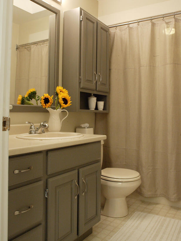
Matching Materials
From the cabinets to the curtains, this bathroom has a washed-over gray that really makes the sunflowers pop.

Flowy Fabric
Masculine tiles and dark wood are accentuated by the crisp, clean white of the shower curtain. Design by Erica Islas.

Sepia Serenity
The soft and glossy stripes of the white shower curtain give this still-life bathroom some motion. Design by Marie Burgos.

Simple Stripes
With the multiple patterns and colors in this bathroom, the simple gray and white curtain anchors this room.
Tuesday, May 6, 2014
A vibrant throw pillow can transform an entire room's decor and deliver a bold color statement. Discover ways to bring a pop of color into your home with beautiful, bright throw pillows.


Natural Palette
Green, yellow and brown decorative pillows brighten up a solid tan couch with a natural — but lively — color palette.
Classic Red
Designer Elizabeth P. Clarke uses a crisp red pillow against a cream chair for a splash of color.
Sea of Turquoise
These eye-popping turquoise pillows are especially noticeable among light furnishings and pastel accessories.
Chic Pink
Small hot pink accent pillows can add a playful touch of color against white pillows and taupe walls.
Gold and Bold
A large gold decorative pillow brings a touch of unexpected color to this small seating area. Design by Erinn Valencich.
Orange Peels
Designer Ammie Kim spices up a simple beige living room with orange throw pillows.
Mellow Yellow
Designer Velvet Hammerschmidt uses bright yellow accent pillows to pop against the crisp white sofa and to complement the pale yellow walls.
Touch of Pumpkin
Pumpkin-colored pillows add a lively visual to the neutral-toned space. Design by Andreas Charalambous.
Neon Scene
An all-white bedroom is bursting with color from vibrant blue pillows and fluorescent yellow accessories.
Rainbow Hues
This white living room gets its burst of color with an array of vibrant decorative pillows on the window seat and couch. Design by Natalie Umbert.Monday, May 5, 2014
These paint color collections make it easier than ever to decorate one space or to create room-to-room harmony throughout your entire home. Courtesy of Sherwin-Williams


The Colors Work On Many Surfaces
Walls, ceilings, trim, floors, furniture, cabinets and accessories — no matter what you're painting, the colors, expertly selected for each collection, work beautifully together.

Coordination Boosts Confidence
"More and more people are becoming confident in their ability to create designer-look rooms all on their own," says Jackie. "Painting walls vibrant colors can be a way for your home to reflect your personality — and it's easy to try something new."

Inspiration Translates to Color Choices
What catches your eye? The sky, a seashell, a car, an outfit, flowers? What's your favorite place? Take note and a pattern will emerge. Notice the colors you love, and then choose the palette(s) in this collection to make your home your favorite place.

You're Not Stuck in Neutral
Each collection features neutral options, but quiet background choices don't have to mean boring spaces. You have the freedom to choose as few or as many and as calm or as bright colors as you wish. No matter how you combine them, you'll always have a perfect palette.


The Color Collections Are Design Guides
Colors within each of the eight collections work beautifully together, no matter how many or how few you select. Pull the hues into window treatments, pillows, fabrics, area rugs and accessories or update the look of furniture with a fresh coat of paint.

You Can Start Small
Paint a dresser, chairs, desk, bookcase or picture frames with a color you love, but are afraid to use in large doses. Or, experiment with a new wall color in a small space like a foyer, powder room or laundry room. Small steps into the world of color increase your confidence.

The Collections Simplify the Simple
Paint color is one of the simplest ways to change the atmosphere of a room — and to have fun with it. It doesn't take an expert to reinvigorate a room with color. Depending on the new shade(s), a room can be dramatically different or simply refreshed. Even a new coating of ivory or light gray over a white wall can make a big difference!
Friday, May 2, 2014
With this collection of blue decorations I hope to be inspiring you to choose the right blue decoration for you ,
Blue feels clean; it smells clean. Blue has many moods. It can be sad and depressing yet it also represents wisdom, trust and loyalty. It evokes feelings of hope, piety and spirituality. If we see blue on a food label we often associate it with lowered calories. Dairy products look inviting if blue is on the packaging. Though a blue tablecloth in a restaurant is good, not all blue in an eating environment will be appealing.
Blue decor: What about a blue room? Designing in blue can be a challenge, yet the results can be quite enjoyable. The challenge comes in knowing how to combine blue with other colors, and choosing the right shades of blue that will be personally pleasing. The White House has long had a blue room.
Blue can be used as a background color on walls and carpeting or it can be used as the foreground color in upholstery and draperies. Pleasant dreams might be the end result of coloring a bedroom in shades of blue. When in a blue environment, time seems to pass slowly and you don't feel rushed.

Cheerful Color Scheme
Sky Blue + Green + Yellow
Using three analogous colors (hues that are next to each other on the color wheel) is a can't-fail color scheme. Blues, greens, and yellows are always a happy combination. Different shades of sky blue serve as the backdrop for fun prints and accessories that showcase the other hues in the palette. A successful color palette also relies on the support of appropriate neutrals. A wicker chair and linen drum shade contribute to the casual vibe and prevent color overload.

Cerulean + Slate + Mahogany
Create a sophisticated statement by pairing three saturated hues together. Here, a background of darkly stained wood furniture is the catalyst that propels cerulean blue chair covers to focal point status. While semi-gloss paint is a popular choice for dining room walls, here, a matte slate gray paint is the subtle background needed to showcase the room's blue elements. A honey-colored jute rug provides a light base to ground a room full of dark hues

China Blue + Rosy Beige
A neutral foundation of rosy beige walls and white sofas allows pops of China blue to make a statement in this living room. Pattern takes shape in the blue damask ottoman, the blue and white striped curtain panels, and pretty floral pillows

Cobalt + Black + White
Dark colors have an air of authority about them -- think of colors chosen for uniforms and suits -- that bring gravitas to room décor as well. When you want to create impact with one splash of color, as on this island in a mostly white kitchen, cobalt blue paint plus a black countertop and black chairs do the job

Sky Blue + White + Pumpkin
Blue and white is a timeless color combination that suits a dining room especially well. Add in some warm pumpkin such as this paisley chair fabric, and you've got a classic palette to welcome your dinner guests.

Steel Blue + Silver + Pearl
Serene blue goes glam with accents of silver gray and pearl white. The palette, a subtle nod to the ocean, evokes a sophisticated feel, especially when sumptuous fabrics and elegant details emanate throughout the room.

Shades of Blue + Lemon Yellow
Multiple shades of blue -- from the deep blue wicker chair to the pale blue sofa -- mix and mingle with lemon yellow accents plus textural neutrals such as beige and white.

Ocean Blue + Red + Leafy Green
Green and blue are a natural pair -- think sky and trees or a stream in the forest. Make any room comfy by including this duo-- as used here on the walls and in accents -- then, throw in red from the warm side of the color wheel to balance the two cooler hues.

Blue + Orange
For a color scheme that provides the most dynamic visual interest, opt for a complementary palette. Colors that lie opposite each other on the color wheel, such as orange and blue seen here, will offer high contrast, giving you a simple combo with a lot of zing.

Sky Blue + Green + Orange
Sky blue upper walls and ceiling provide the happy envelope for this charming playroom. Vivid green coats the lower walls and covers upholstered chairs in a chipper green tonal stripe fabric. The two hues meet in the middle on the striped curtains. A desk wows the room in warm orange.
You can find ideas on how upgrade your existing Room , I hope you like it . Enjoy !
Blue feels clean; it smells clean. Blue has many moods. It can be sad and depressing yet it also represents wisdom, trust and loyalty. It evokes feelings of hope, piety and spirituality. If we see blue on a food label we often associate it with lowered calories. Dairy products look inviting if blue is on the packaging. Though a blue tablecloth in a restaurant is good, not all blue in an eating environment will be appealing.
Blue decor: What about a blue room? Designing in blue can be a challenge, yet the results can be quite enjoyable. The challenge comes in knowing how to combine blue with other colors, and choosing the right shades of blue that will be personally pleasing. The White House has long had a blue room.
Blue can be used as a background color on walls and carpeting or it can be used as the foreground color in upholstery and draperies. Pleasant dreams might be the end result of coloring a bedroom in shades of blue. When in a blue environment, time seems to pass slowly and you don't feel rushed.

Cheerful Color Scheme
Sky Blue + Green + Yellow
Using three analogous colors (hues that are next to each other on the color wheel) is a can't-fail color scheme. Blues, greens, and yellows are always a happy combination. Different shades of sky blue serve as the backdrop for fun prints and accessories that showcase the other hues in the palette. A successful color palette also relies on the support of appropriate neutrals. A wicker chair and linen drum shade contribute to the casual vibe and prevent color overload.

Rich Color Palette
Cerulean + Slate + Mahogany
Create a sophisticated statement by pairing three saturated hues together. Here, a background of darkly stained wood furniture is the catalyst that propels cerulean blue chair covers to focal point status. While semi-gloss paint is a popular choice for dining room walls, here, a matte slate gray paint is the subtle background needed to showcase the room's blue elements. A honey-colored jute rug provides a light base to ground a room full of dark hues

Refined Color Scheme
China Blue + Rosy Beige
A neutral foundation of rosy beige walls and white sofas allows pops of China blue to make a statement in this living room. Pattern takes shape in the blue damask ottoman, the blue and white striped curtain panels, and pretty floral pillows

No-Fail Color Scheme
Cobalt + Black + White
Dark colors have an air of authority about them -- think of colors chosen for uniforms and suits -- that bring gravitas to room décor as well. When you want to create impact with one splash of color, as on this island in a mostly white kitchen, cobalt blue paint plus a black countertop and black chairs do the job

Classic Color Scheme
Sky Blue + White + Pumpkin
Blue and white is a timeless color combination that suits a dining room especially well. Add in some warm pumpkin such as this paisley chair fabric, and you've got a classic palette to welcome your dinner guests.

Luxe Color Scheme
Steel Blue + Silver + Pearl
Serene blue goes glam with accents of silver gray and pearl white. The palette, a subtle nod to the ocean, evokes a sophisticated feel, especially when sumptuous fabrics and elegant details emanate throughout the room.

Upbeat Color Scheme
Shades of Blue + Lemon Yellow
Multiple shades of blue -- from the deep blue wicker chair to the pale blue sofa -- mix and mingle with lemon yellow accents plus textural neutrals such as beige and white.

Comfy Color Scheme
Ocean Blue + Red + Leafy Green
Green and blue are a natural pair -- think sky and trees or a stream in the forest. Make any room comfy by including this duo-- as used here on the walls and in accents -- then, throw in red from the warm side of the color wheel to balance the two cooler hues.

Complementary Color Scheme
Blue + Orange
For a color scheme that provides the most dynamic visual interest, opt for a complementary palette. Colors that lie opposite each other on the color wheel, such as orange and blue seen here, will offer high contrast, giving you a simple combo with a lot of zing.

Playful Color Scheme
Sky Blue + Green + Orange
Sky blue upper walls and ceiling provide the happy envelope for this charming playroom. Vivid green coats the lower walls and covers upholstered chairs in a chipper green tonal stripe fabric. The two hues meet in the middle on the striped curtains. A desk wows the room in warm orange.
Subscribe to:
Posts (Atom)


.jpg)

